
Entry points
Check that onboarding, home, login, and first-use screens lead into the app without leaving the user at a dead end.
Pixelmost Graph Mode turns mobile app screens and links into one visual map, so you can review navigation, missing routes, and overloaded sections before user testing or handoff.
Use it after AI generation, during prototype review, or before TestFlight planning when the team needs to understand the whole product structure instead of one screen at a time.
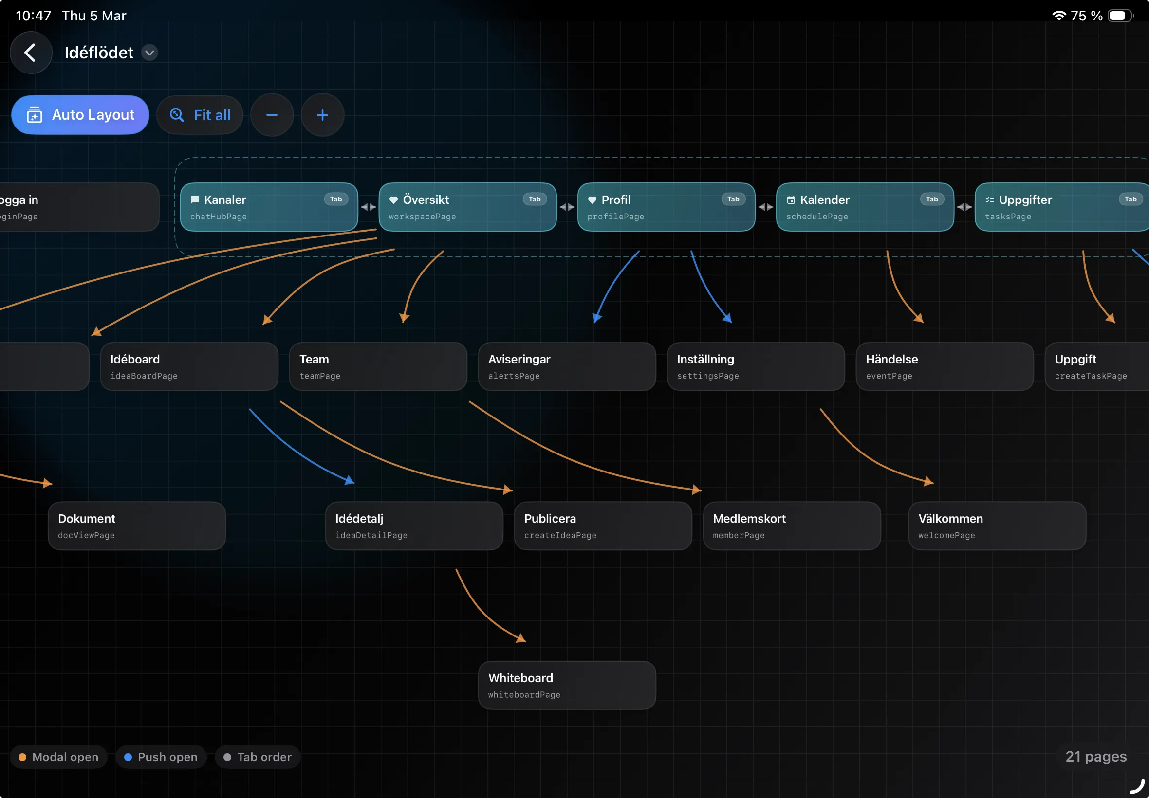
A mobile app flow is not only a list of screens. It is the set of decisions, exits, loops, and next steps that a person meets while using the app. A useful flow visualizer makes those connections visible enough that you can find problems while they are still cheap to change.
In Pixelmost, Graph Mode shows pages as nodes and links as connections. That gives product teams a practical overview after a prompt-generated prototype, a larger editing session, or a client review where new screens were added quickly.
The goal is not to make a perfect diagram. The goal is to catch the places where the app does not yet behave like a product: orphaned screens, hidden settings, loops without a clear exit, account paths that skip important steps, or marketing pages that do not lead back into the core task.
Check that onboarding, home, login, and first-use screens lead into the app without leaving the user at a dead end.
Follow the main product task from start to finish. A booking app, fitness tracker, marketplace, or admin tool should each have one path that is obviously central.
Look for modal screens, detail pages, and settings views that need a reliable way back to the right parent screen.
Review upgrade, empty state, error, support, and account paths separately so secondary flows do not quietly break the main experience.
| Prototype problem | What to look for in the map | Next Pixelmost view |
|---|---|---|
| Onboarding feels longer than expected | Too many early nodes before the first useful product screen | Navigation Mode for the first-run journey |
| A feature is hard to find | Useful screens with weak or missing incoming links | All Pages to compare labels and destinations |
| Settings or account screens feel detached | Nodes that connect only one way or return to the wrong area | Single Preview for header, back, and tab behavior |
| The prototype is ready for a stakeholder review | Main journey has a start, completion point, and recovery paths | Export screens or continue to TestFlight planning |
A visual map helps you reason about structure, but it does not replace testing the actual interaction. Use Graph Mode for reachability, rough sequence, and flow complexity. Use Navigation Mode when button behavior, transitions, and tap order matter.
If the work is still mostly visual, start with the App Mockup Tool. If the question is whether screens connect correctly, use the App Prototype Tool and Graph Mode together. If the prototype is stable enough to put on a device, continue with the TestFlight workflow.
Graph Mode is also not a substitute for product decisions. If two flows compete, the map will show the conflict, but the team still needs to choose which journey matters most for the first version.
For a marketplace prototype, map search, item detail, checkout, order status, seller profile, and refund or support paths. The graph should make it clear how a buyer completes a purchase and how they recover if payment, delivery, or account setup needs attention.
For a subscription app, map onboarding, paywall, account creation, upgrade, cancellation, settings, and the first useful feature screen. This makes it easier to spot when the prototype explains pricing too early, hides account controls, or sends users back to the wrong place after signup.
For an internal operations app, map dashboard, task detail, filters, notifications, approval flows, error states, and admin screens. These prototypes often fail when every screen is individually understandable but the work queue, detail view, and completion path do not connect cleanly.