
Graph Mode in Pixelmost: See Your App Structure in One View
Published February 11, 2026 · Updated July 14, 2026
Graph Mode shows your screens and their connections in one view, making it easier to review structure, navigation, and missing paths before testing.
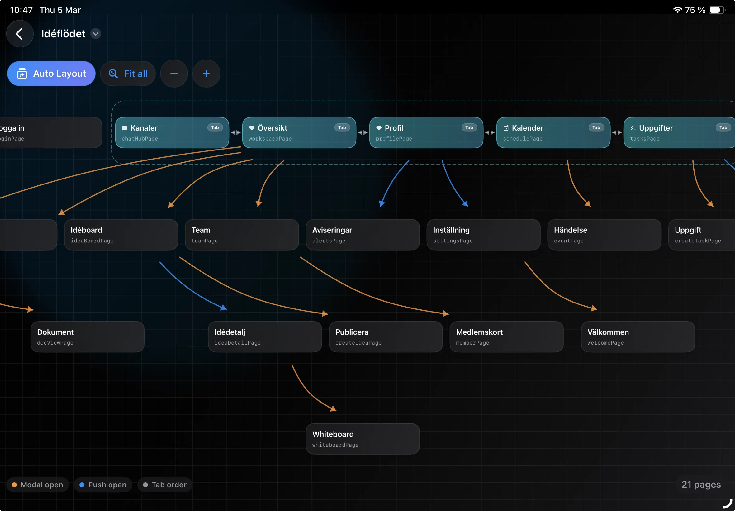
Once a project grows beyond a few screens, it gets harder to keep track of what links where. Graph Mode solves that by showing the structure in one view, so you can review the project without opening every screen one by one. For a broader feature overview, see the App Flow Visualizer page.
What Graph Mode shows
Graph Mode displays screens as nodes and the connections between them as lines. That gives you a quick way to inspect entry points, branching paths, and screens that are isolated or overloaded with links.
Use it as the wide-angle review after an AI generation or a larger editing session. The graph helps you decide where to investigate; it does not replace tapping through the experience in Navigation Mode.
What to check in Graph Mode
- Screens with no incoming link
- Screens with no clear next step
- Flows that take more steps than necessary
- Sections of the app that are harder to follow than they should be
When it is most useful
Graph Mode is most useful once the project has several sections, such as dashboard, settings, profile, onboarding, or payments. At that point, it is easy for the structure to drift away from the intended flow if you only review screens one at a time.
A practical review workflow
- Start with one key flow, such as signup or first purchase
- Follow the links screen by screen until the flow is complete
- Check that every important screen is reachable in the way you expect
- Simplify or reconnect screens that feel detached or overly complex
The goal is not to make the graph look tidy for its own sake. The goal is to make the product easier to understand and easier to move through.
Move from structure to interaction testing
- Start in Graph View: find isolated pages, unclear branches, and sections with too many or too few connections.
- Switch to Navigation Mode: tap through the same journey like a user and verify that buttons, tabs, back navigation, and modal paths lead where expected.
- Scan All Pages: compare the relevant screens together to find missing states, repeated layouts, and inconsistent visual treatment.
- Finish in Single Preview: inspect the layout, spacing, and hierarchy of any page that needs focused work.
For a larger concept, repeat this sequence one journey at a time rather than trying to validate the whole app in one pass. The App Prototype Tool overview explains how these views fit into the wider prototype workflow.
Review common journey patterns separately
Different parts of an app fail in different ways. Review onboarding for a clear start and completion point. Review tab-based sections for routes that jump unexpectedly between areas. Review modal or detail flows for a reliable way back. Finally, check that empty, success, and error destinations are represented where they matter to the journey.
Useful in team reviews
Graph Mode also helps when you review a project together. Instead of describing the structure from memory, the team can look at the same map and discuss where flows are unclear, where links are missing, and which parts of the product need to be simplified.
Good to review before testing or export
A quick pass in Graph Mode before handing the project off or moving on to testing can save time later. It is a simple way to catch missing routes, extra steps, or structural issues before they show up during QA.
If the structure is still visual and exploratory, return to the App Mockup Tool workflow. When the core journeys are stable enough for a real-device check, continue to the TestFlight upload workflow.
Summary
Graph Mode gives you one place to review screen structure and connections. For larger projects, that makes it easier to find gaps, tighten key flows, and check that the app behaves the way you intended.