
App Color Theme Generator for Mobile UI
Color is one of the fastest ways to make a mobile app concept feel specific, but it is also one of the easiest places to create noise. This guide shows a Pixelmost workflow for generating a color direction, checking it across screens, and keeping the app icon, mockups, and export visuals aligned.
Short answer
Use Pixelmost as an app color theme generator when you need a first visual system for a mobile app concept: a background direction, accent color, screen mood, and icon style that can be reviewed together. It is strongest before the brand system is locked. If your team already has a mature brand guide or design system, use Pixelmost to explore alternatives, then reconcile the final colors with your existing tokens.
When color generation helps
A blank mobile screen often makes every decision feel equally important. Color gives the concept a point of view: calm finance app, high-contrast fitness tracker, warm travel planner, clinical health dashboard, or playful habit builder. In Pixelmost, that direction can be explored while the screens, app icon, and export composition are still flexible.
The useful output is not a random palette. It is a small set of decisions that survives real mobile UI: a primary action color, a background or surface system, readable text, a supporting accent, and an app icon direction that does not look detached from the screens.
Start from the product job, not a color name
Prompts such as "make it blue" or "use a modern gradient" rarely produce a reliable theme. Start by naming what the app does, who uses it, and what the interface should feel like during the main task. Pixelmost can then generate a direction that responds to the product rather than only the color word.
Budgeting app: "A calm mobile budgeting app for freelancers, warm off-white background, deep green primary actions, restrained amber highlights, clear charts, no neon colors."
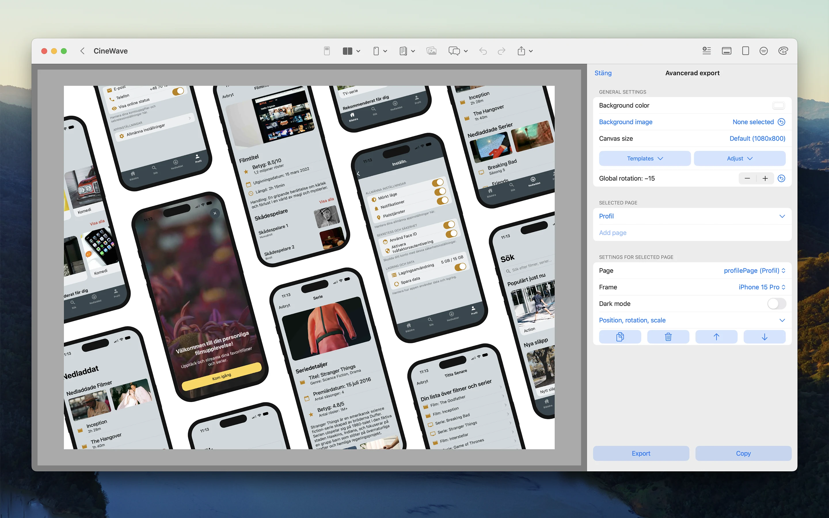
Movie tracker: "A cinematic movie watchlist app, muted charcoal navigation, gold accent for saved films, soft gray cards, readable light mode screens."
Habit tracker: "A friendly habit tracker for morning routines, fresh green accent, pale sky surfaces, one coral warning color, simple iOS-style controls."
Travel planner: "A travel itinerary app for families, sand background, ocean blue primary buttons, sunset accent, high contrast text, practical booking screens."
Each prompt gives the model more than a color. It defines product category, emotional range, surface choices, and where the accent should be used. That makes the first generation easier to judge.
A practical Pixelmost workflow
A color theme is easier to evaluate when it is applied to several screens. Use a narrow journey first: onboarding, the main dashboard, one detail screen, settings, and an empty state. This gives you enough variety to catch contrast problems without turning the exercise into a full design system project.
- Generate the first app direction. Describe the app, audience, main screens, and color mood. Keep the prompt short enough that the model can choose a coherent direction.
- Check the primary action. The main button should be obvious on every important screen. If it competes with backgrounds, icons, tags, or illustrations, simplify the palette.
- Review surfaces and text. Make sure cards, toolbars, input rows, charts, and navigation are readable in the generated screens. A beautiful palette that weakens body text will fail in a real app.
- Align the app icon. Use the same visual direction in the AI Logo Maker or the app logo guide. The icon does not need to reuse every color, but it should feel like it belongs to the same product.
- Export a review composition. Use Pixelmost export options to create a screen set or presentation image that makes the theme easy to compare with other directions.
What to check before keeping a theme
The first generated direction is a sketch, not the final answer. Before you present it, run a small quality pass. The goal is to remove fragile choices early, while changing the palette is still cheap.
Contrast
Body text, small labels, tab items, disabled states, and chart labels need enough contrast. Pay special attention to colored text on tinted surfaces.
Role clarity
One color should clearly mean primary action. Error, warning, success, and selection states should not all compete for attention.
Screen variety
Check the theme on forms, lists, detail screens, empty states, and media-heavy screens. Some palettes look good only on a hero screen.
Export readability
If you rotate screens, add a background image, or create a pitch-deck composition, make sure the app screens still remain the focus.
Dark mode and accessibility limits
A generated light theme does not automatically become a good dark theme by inverting the colors. Dark mode usually needs separate surface roles, adjusted shadows, less saturated accents, and stronger separation between navigation, cards, and modal content. If you are exploring both appearances, generate or edit them as two related directions rather than one automatic conversion.
Accessibility checks should happen before a theme becomes the default direction. Look at small text, disabled controls, input placeholders, alerts, chart legends, and tab labels. These are the places where attractive palettes often break first. If the app will be used outdoors, in bright offices, or by people who need larger text, prioritize contrast and spacing over subtle color nuance, especially on repeated screens users will see every day.
Common mistakes
- Too many accent colors. A mobile concept usually needs one primary accent and one restrained support color, not a full rainbow.
- Gradient-first thinking. A gradient can work as an icon or background detail, but it should not be the only thing making the app feel designed.
- Ignoring neutral surfaces. Most app screens are made from text, lists, controls, and cards. The neutrals decide whether the app feels usable.
- Designing only for the first screen. A color direction has to survive settings, account screens, alerts, empty states, and boring operational views.
- Separating icon and UI too late. If the app icon uses a different mood from the screens, the product can feel stitched together.
When to choose another method
Use a formal design-token workflow when the product already has accessibility-reviewed color roles, brand approvals, and engineering constraints. Use Figma or another design-system tool when many people need to manage shared component libraries and token governance. Use Pixelmost earlier: when the job is to discover which color direction makes the mobile app concept clearer.
For client work, Pixelmost is most useful when you need to show two or three believable directions quickly. For product work, it is useful when a team needs to compare how different themes affect perceived category, trust, energy, and readability before committing design time.
Example review brief
When you share generated screens, ask for feedback with a focused brief instead of asking whether people "like the colors." A better review question is: "Which direction makes this app feel easier to trust and use for the first week?" That keeps the discussion tied to the product job.
| Review area | Question to ask | What to change next |
|---|---|---|
| First impression | Does the app feel like the right category? | Adjust background, icon mood, and primary accent. |
| Main task | Is the next action obvious without reading every label? | Simplify action color and reduce competing highlights. |
| Long-term use | Would this palette stay comfortable after daily use? | Lower saturation, strengthen text, and calm surfaces. |
| Pitch export | Do the screens remain readable inside the composition? | Change export background, scale, or rotation before sharing. |
Compare three directions, then cut one
A useful color pass usually needs contrast between options. Generate one restrained direction, one more expressive direction, and one category-specific direction that follows the strongest visual convention for the market. For a finance app, that might mean calm green, warmer editorial neutrals, and a darker premium dashboard. For a movie app, it might mean cinematic charcoal, light magazine-style surfaces, and a poster-forward theme.
Do not keep all three alive for too long. After the first review, remove the weakest direction and spend the next pass comparing only two. This keeps the team from debating abstract preferences and makes the next decision more concrete: which theme makes the product easier to understand, and which one creates less downstream design work when the app needs more screens and states?
Connect the theme to the rest of the workflow
After the color direction feels stable, connect it to the rest of the app concept. Use the App Mockup Tool to refine screen hierarchy, the App Prototype Tool to review the journey, and Graph Mode to check that the screens still form a coherent structure. If the product is moving toward device testing, review the TestFlight workflow so visual polish and release preparation do not become separate conversations.